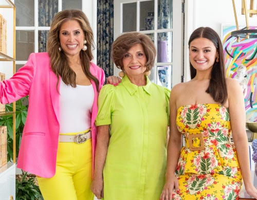
I have loved hearing all of your feedback about my home renovation reveal in the December issue of Traditional Home. Now let’s dig into some of my favorite details from my project, starting with the Kitchen.
As you all know, I love to cook, so of course, my kitchen is one of the hardest working rooms in my house and designing it was definitely a labor of love.
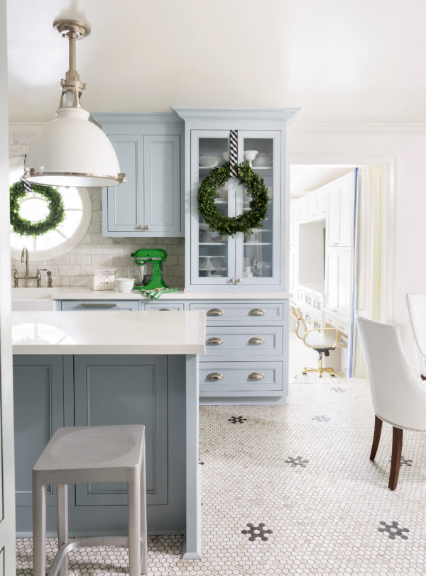
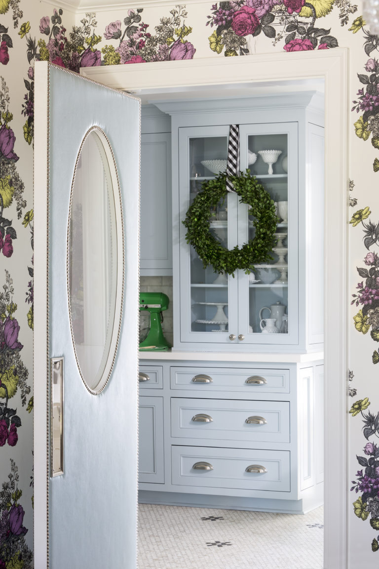
The “after” is full of amazing Thermador appliances, fabulous storage solutions, and all wrapped in the most calming shade of blue! But let’s talk about the transformation from drab, dark, dated and dysfunctional to my dream kitchen.
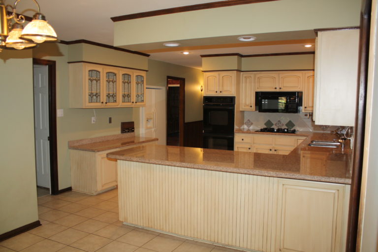
Ok, I’m cringing revisiting my kitchen before photos. The colors were dated with a sort of mauve and celery green speckled granite, glazed cabinets, celery walls, dark stained trim and a very 70’s pass-through over the sink into the sunroom. I honestly can hardly remember it looking like this even though I lived it in for TWO YEARS!
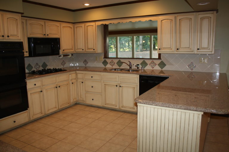
The overall layout of the kitchen before is actually not all bad, the U-Shape kitchen is very common and considered one of the most functional kitchen layouts. But this old space didn’t provide enough of a work surface for my cooking or my daughter’s baking. And with the upper cabinets stopping below a soffit, and having fixed shelving inside, they didn’t provide ample storage for all my china, serving ware and small appliances. It was definitely time for this space to go!
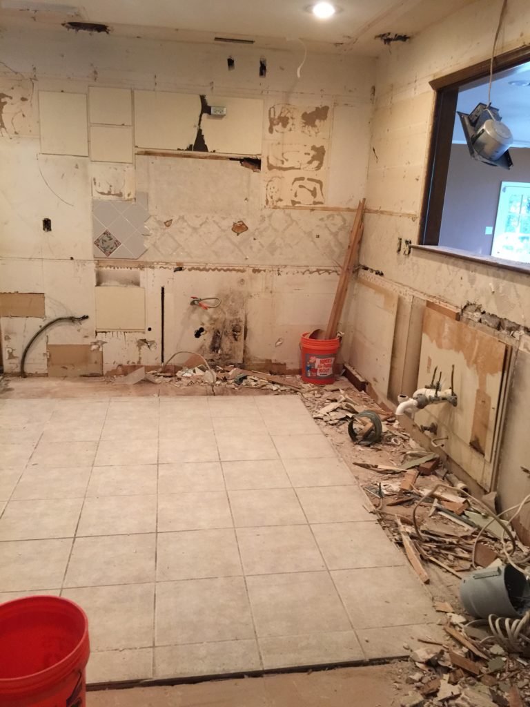
First, we gutted everything, and eliminated a laundry closet behind my range. This allowed me to extend the kitchen an additional 3 feet and to make room for a massive island!
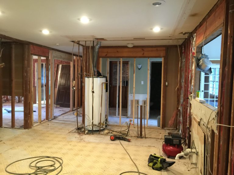
Seeing this photo of the space all the way down to the studs was still prettier to me than the before. After two years in this drab space, this looked like amazing progress to my eyes.
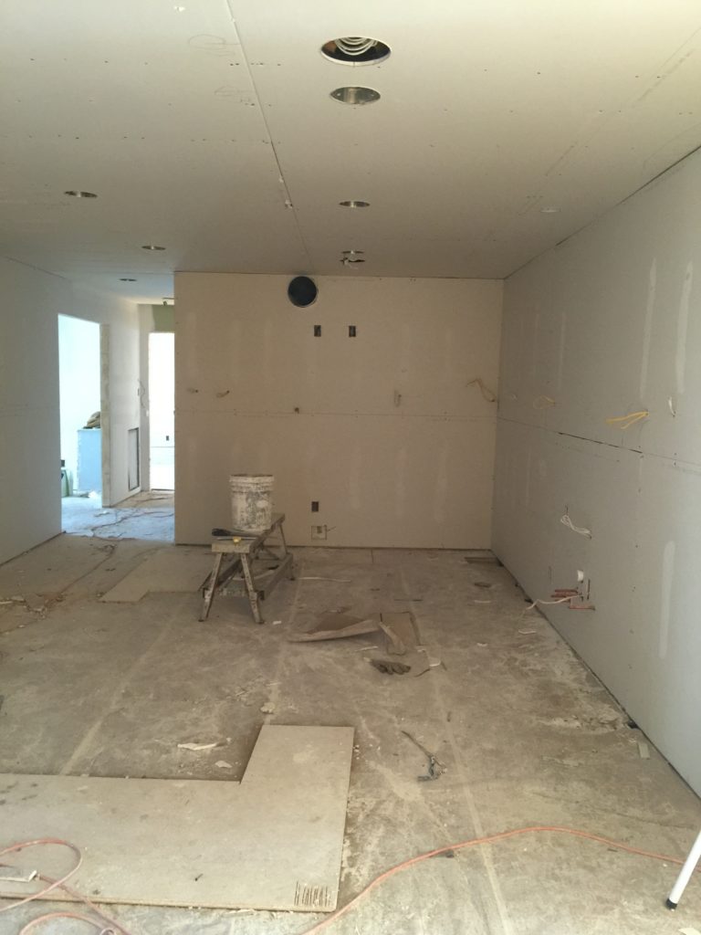
Just getting sheetrock on the walls made the kitchen look large and fresh. This is when things started to get super exciting!
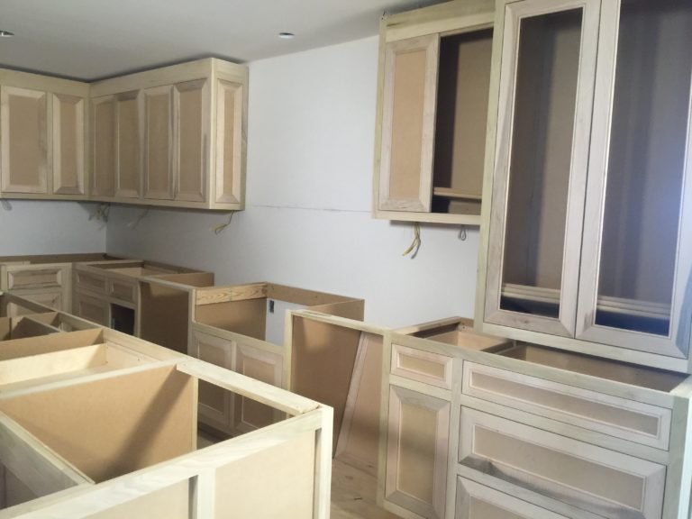
Cabinetry was next and I was dying for the interior window to go in over the sink. Remember the old pass-through before? …
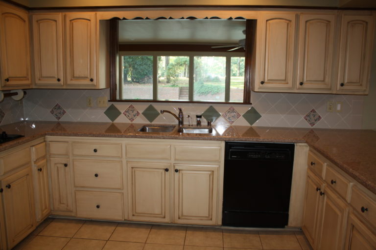
How could you forget, right?
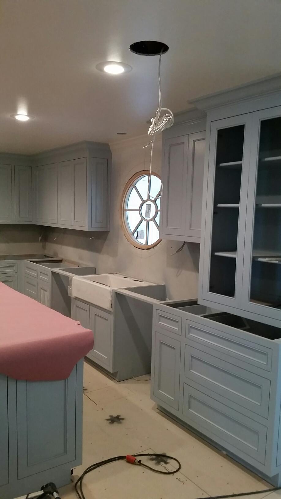
My solution for a more classic style was adding an all wood oval window between the kitchen and the sunroom. This interior window now looks like it’s always been here. It feels architecturally appropriate for this 1960’s home and it’s many people’s favorite feature in my kitchen, including mine.
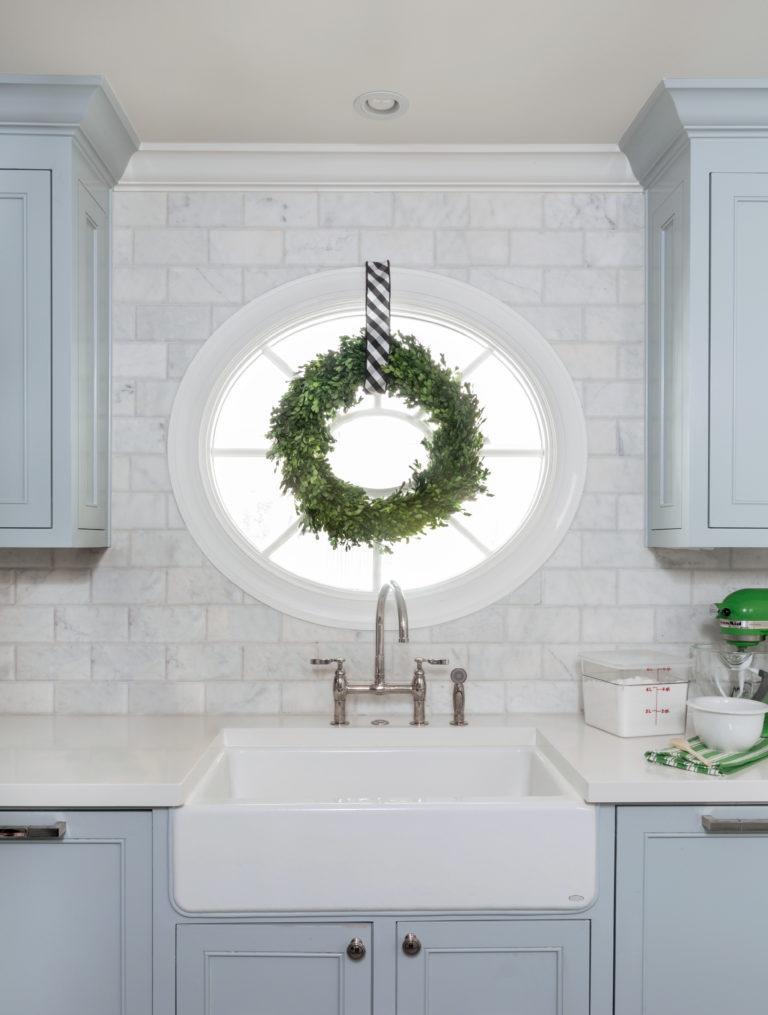
I love having a view out through my sunroom and to the pool beyond. And the gorgeous Kohler sink and faucet make this area even more lovely.
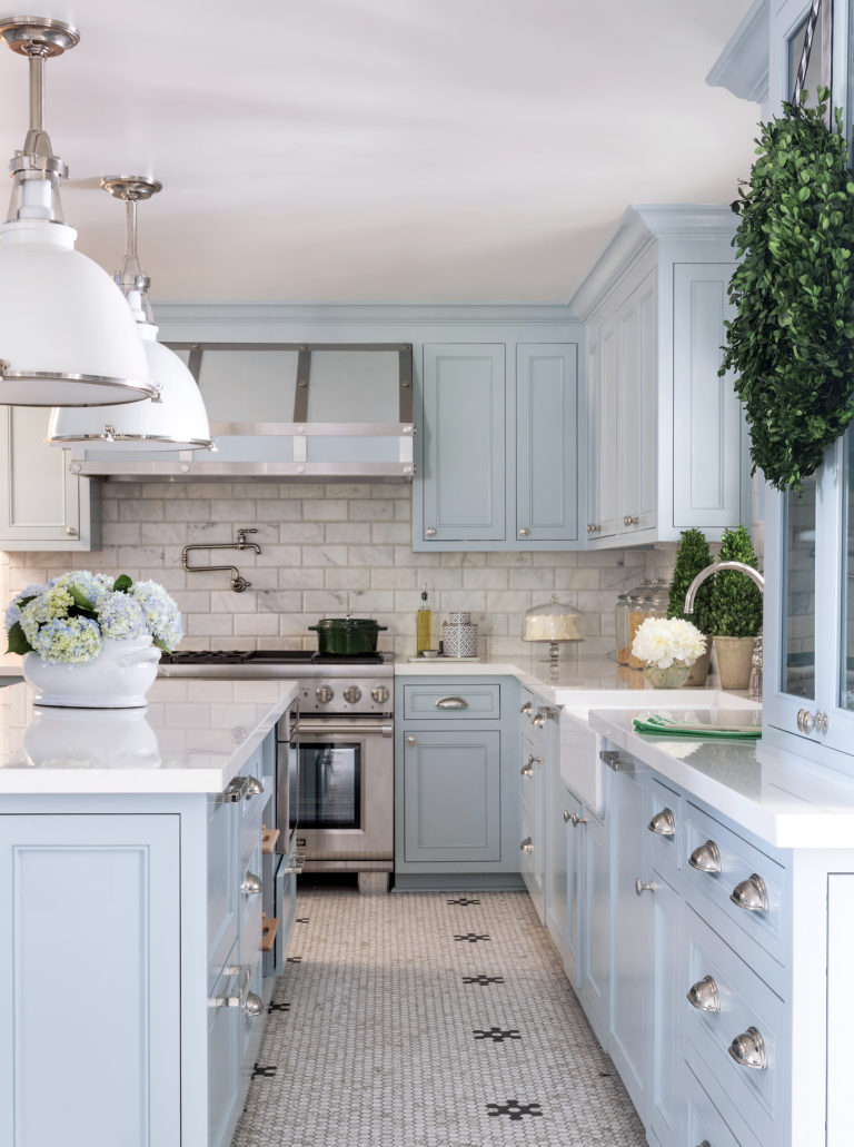
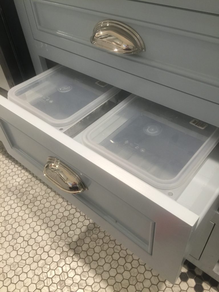
Everything in my kitchen design is so relaxing, and better yet, functional. I changed from the U-shaped layout to an island layout that provides me with so much more workspace. And in the 9′ long island I have included fun details like Thermador refrigerator drawers, microwave drawer, and warming drawer, plus baskets for fruits and veggies, a paper towel holder and a baking drawer that holds my dry ingredients like flour and 3 types of sugar.
And you can’t see it from here, but on the sink side of the kitchen are 2 dishwashers, which means my sink almost NEVER has a dirty dish!
Now after seeing how gloomy my previous kitchen was, you can see why I went with a bright white, pale blue, and polished nickel color palette! But before we go a few last details…
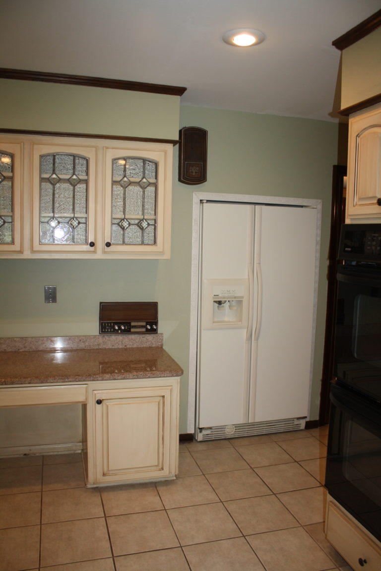
Remember my old and very odd refrigerator in the before? It was tucked under the entry stairs and accented with beauty mold around it like we wanted to highlight it, ha! It was next to a desk space that was a catch all for everything that made it’s way into the kitchen. And let’s not forget to mention that retro intercom system and gigantic doorbell hanging on the wall.
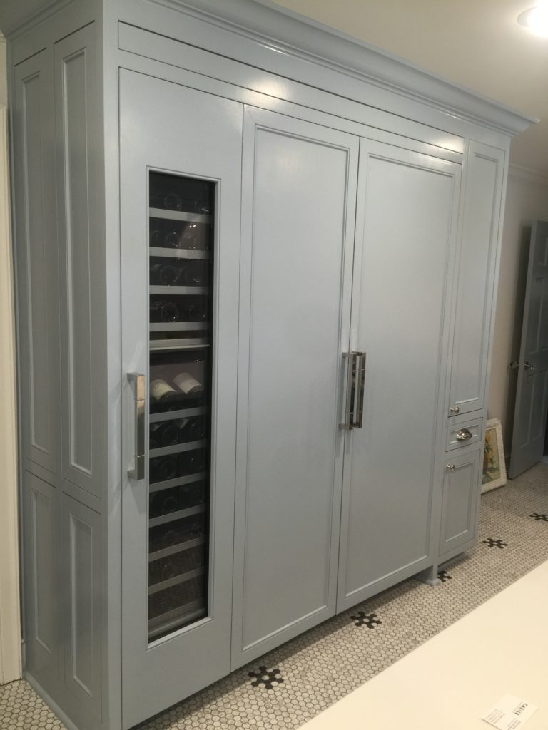
The after of this same wall is now my fantastic Thermador 30″ refrigerator column, 24″ freezer column, and an 18″ wine column.
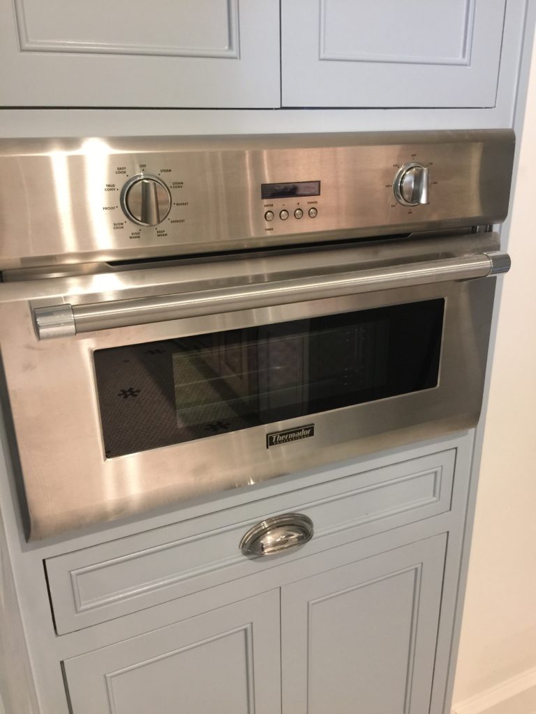
And to the right of these is where you can find my steam oven with lots of storage above for baking sheets and small appliances and pulls outs below for anything else I want close at hand. Tucked into the wall where that old refrigerator was, this is definitely my favorite new gadget in the house!
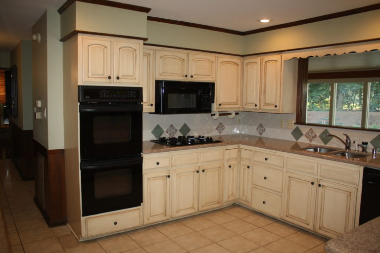
My previous kitchen had a teeny tiny range with a microwave above that didn’t allow me to cook fabulous, big meals for my family. The wall ovens were functional but equally dated. I needed to replace all these black appliances with some new, top-of-the-line Thermador pieces that work hard for my family and me.
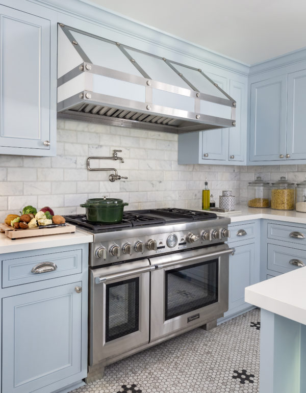
Let’s get up-close and personal with my amazing new range from Thermador. This 48 inch professional series dual fuel range has 6 burners, a griddle, and 2 convection ovens! I can make literally anything and everything my family and friends would ever want to eat here. And the griddle can be switched out for an indoor grill. We created this custom hood with local craftsman. It houses a Thermador vent insert inside and has stainless steel straps on the exterior and is painted in my dreamy blue cabinet color called Slinky by C2 Paints. And here you get a great look at my marble subway backsplash Speartek, Daltile bistro floors that are actually glass tile even though they look like marble, and lacquer-look white Dekton countertops.
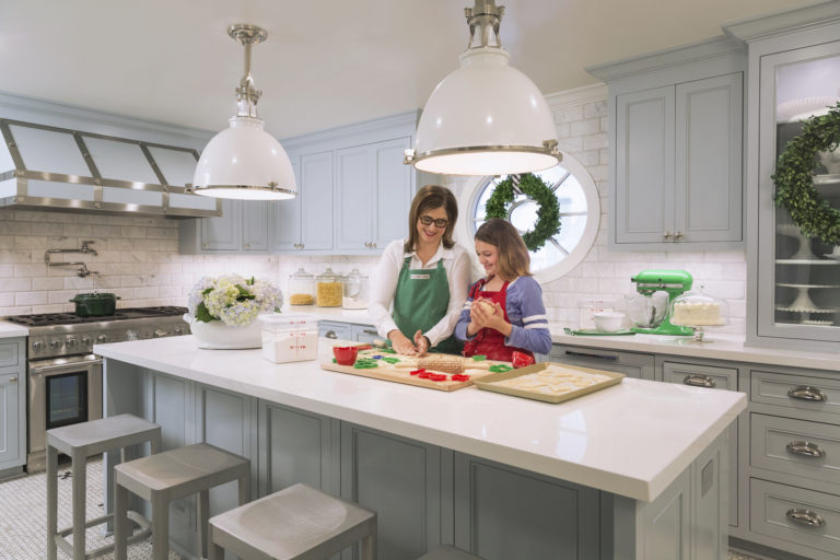
So there you have it…the sad before and the fabulous after of my new kitchen. I’m in love with everything about this space and I can’t stop singing its praises! I can honestly say, this kitchen has everything I could want. And I know my daughter and I will be cooking and baking in it together for years to come!
Leave me a comment and let me know what you think about my kitchen transformation. What’s your favorite part and what questions do you have? And to see more of my home renovation pick up the December issue of Traditional Home Magazine. And be sure to check out all the online content from my year-long renovation column with Traditional Home on their website. There are all sorts of tips, details and inspiration there for designing your own dream kitchen and dream home.
xo,


