I have been saying for years that a master bedroom should be a serene retreat. That likely came after I designed our first bedroom after my husband and I married, in bright red. And I wondered why we could never relax. Rookie mistake for sure! But my new Master Suite is relaxing in every way.
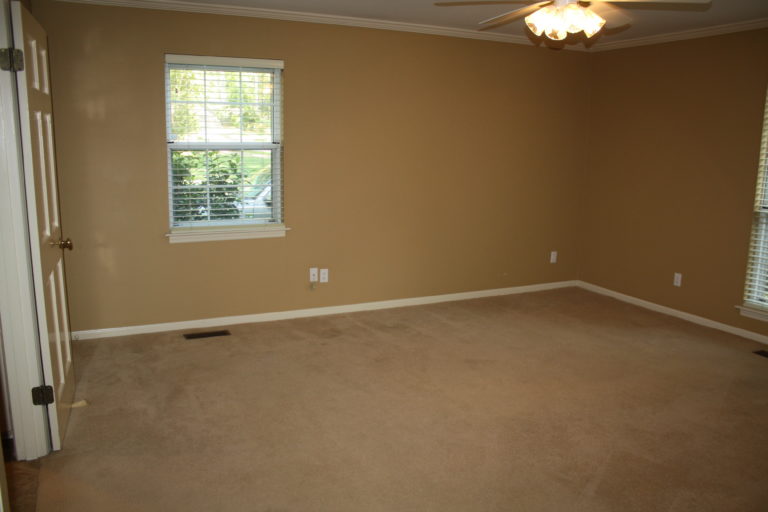
But that wasn’t always the case. These drab tan walls and beige carpet were neither inspiring nor relaxing when we purchased the home. I needed a plan to transform my master bedroom into a spot for unwinding from our hectic work schedules and chilling with an extra cup of coffee on the weekends. And what was my color of choice for this plan? Pale Blue, of course. It was already the color palette I’d selected for my nearby kitchen, so the bedroom design took off from there.
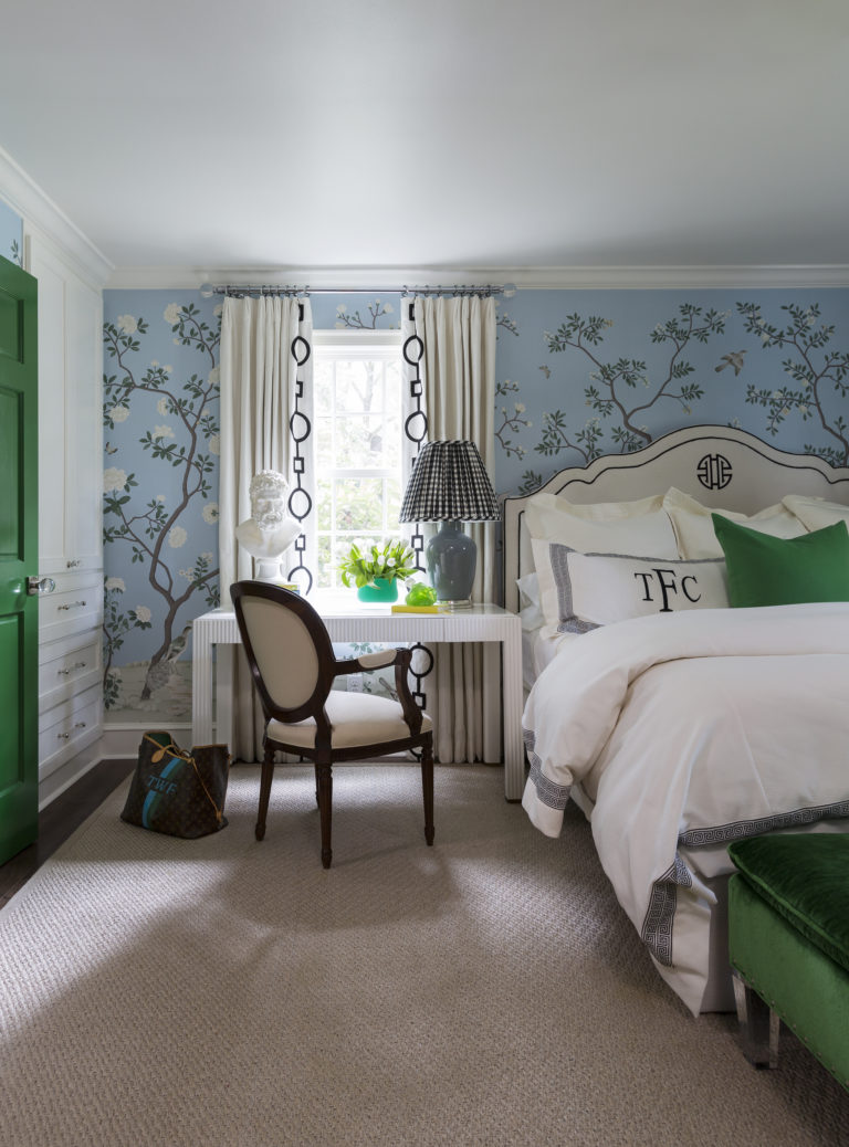
The pale blue provided the perfect back-drop for the fabulous custom-colored chinoiserie wallpaper from Fromental. And the best part is that this is one of their digital patterns so it’s not only a custom color, it’s a less expensive version of the hand-painted papers. From there, I knew I wanted to use classic black-and-white to give the space a bit of a modern feeling, and I love how my Lucy bed from CR Laine with a black welt and logo embroidery was the perfect place to start. Throw in a few pops of my favorite color, Kelly Green, with my cherished geometric patterned wing chairs and a new hot green velvet on the Paris bench from my CR Laine collection and this space was really coming to life.
But I didn’t stop there, I wanted to bring that same green accent into my bathroom with a lot of timeless black and white finishes. Here’s a peek into that space. Doesn’t it transition beautifully from the bedroom?
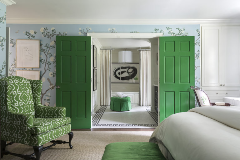
I painted the double doors that lead to my bathroom in the same stunning green with fabulous crystal knobs that feel like jewelry. These doors offer a beautiful burst of color and perfectly frame the view into my new bathroom, which is a great thing when a bathroom is beautiful and spa-like. But getting to that result was a process too…
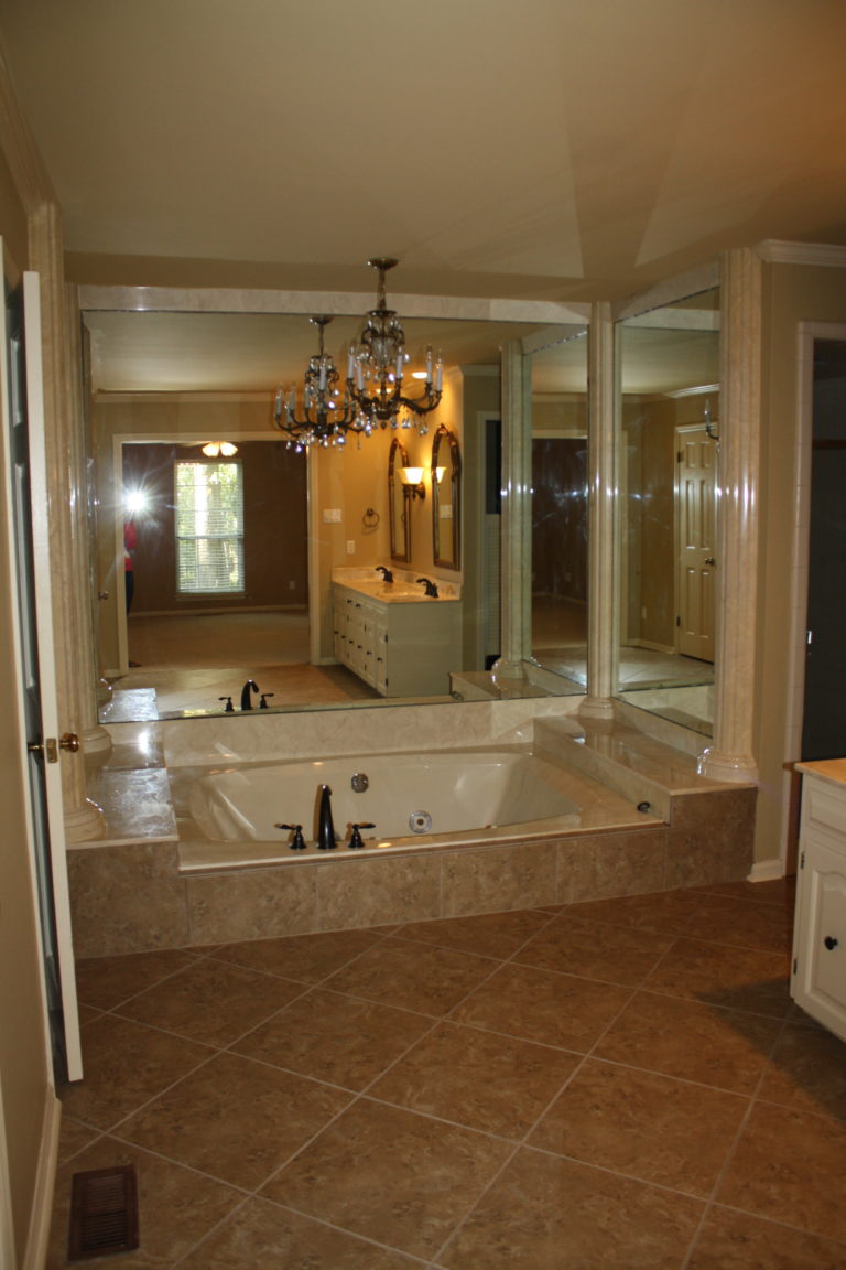
My bathroom before was dark and dreary with a huge party tub surrounded by giant mirrors- just what you want to wake up to every morning, right? Wrong!
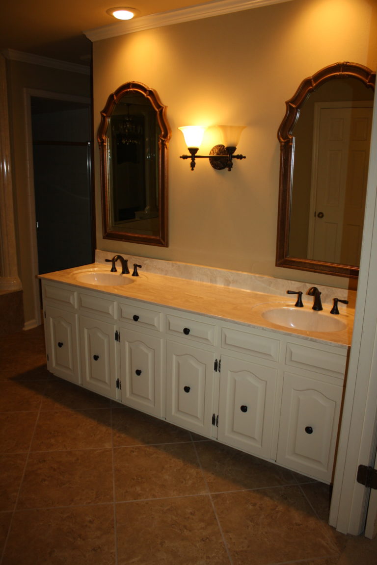
Bad finishes like tile and cultured marble, very low cabinets, bad lighting, and the tiny shower made this space extremely dysfunctional.
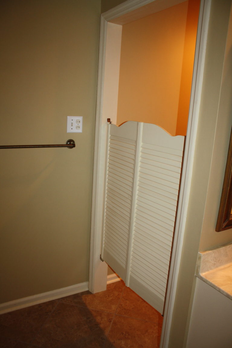
Still one of the worst design elements (if you can call it that) were these swinging saloon-style doors on the way to the toilet (yee haw!). Calling this room dated was an understatement for sure.
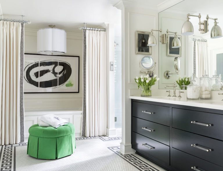
But not anymore! No more scary mirrors surrounding this tub. Everything is black and white and effortlessly chic. My favorite Greek key motif makes an appearance on the floors as a border and down the drapery surrounding my new Kohler VibrAcoustic tub (it plays music, y’all!). Hudson Valley Lighting helped me take this space from dark to bright and beautiful. And there’s even a touch of green on my round ottoman and in the commissioned art by Ashley Saer.
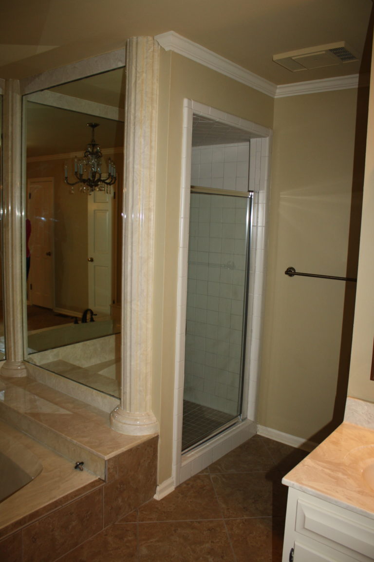
One big problem in the before of this space (besides those bad cultured marble columns, ha! ) was the lack of natural lighting. There was no window in this room at all which made the dark colors feel even darker. This space felt like a dungeon and did little to help start our days on a happy note. Plus look how cramped that shower was with the teeny tiny glass door. You could touch the shower ceiling while standing flat-footed because the ceiling was so low, and if you raised your elbows to wash your hair, it was easy to hit the walls on either side. It was far from luxurious or roomy.
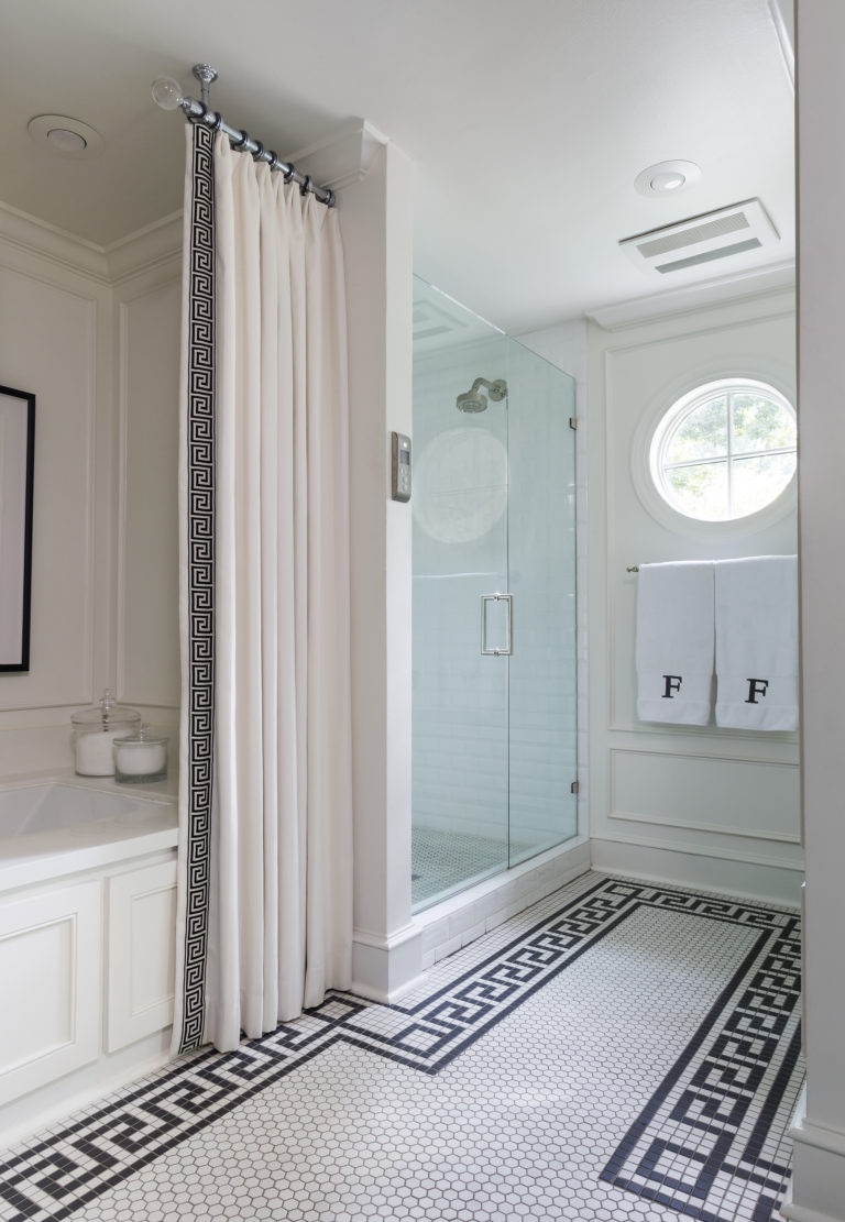
I added this fabulous round window that now fills my bathroom with natural light every day, and it made all the difference in our attitudes and morning routine. And look how much bigger the shower is. We’ve got head room, arm room and a gorgeous sleek design with beveled white subway tile from Daltile and a frameless glass door. Plus the fancy Kohler pluming with digital controls makes the shower experience feel like a dream. And with a shower head on each side so you stay warm on all sides even in the winter.
I can’t wait to walk you through the other design changes in my new home in my Before and After Series. So check back soon to see what other changes I’ve made!


