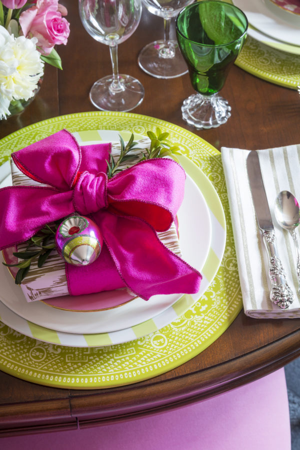
I love entertaining and hosting dinner parties for my friends and family. It gives me a chance to serve up some of my favorite meals, try new recipes, and show them my new dining room. And now that it’s Christmas season, this room has really gotten a lot of use.
But enough about entertaining, let’s talk about my dining room decor. I love creating unique color combinations for my clients and my own home. So when deciding on my new dining space, I went with a bit of an unconventional color scheme that I think really paid off.
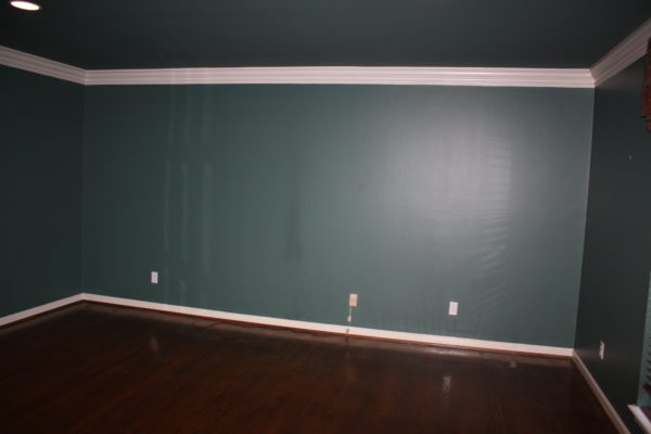
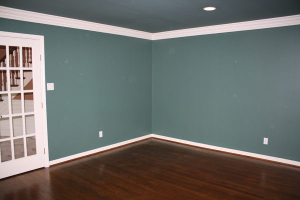
So before I show you the finished product, let’s look at what this space started out as. The previous owner used this room as a study instead of a dining room, but its long, rectangular shape lends itself to my large oval dining table much better. And while I love the 90’s hunter green that is making a comeback in interior design, this shade didn’t hit the mark for my family and me! It made the room extremely dark and dreary.
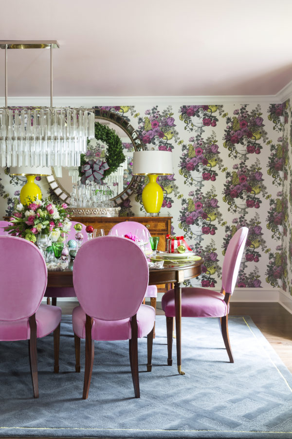
I lightened the entire space with fresh pink and bright yellow floral wallpaper topped with a soft petal pink ceiling! I couldn’t resist the drama of that Clarke & Clarke wallpaper and pulling out those pops of yellow with the Jan Showers lamps and the silk drapery panels that are sort of yellow and sort of Chartreuse. There’s even a tiny splash of chartreuse bordering my gray “Logo Grand” rug from my line with New River Artisans!
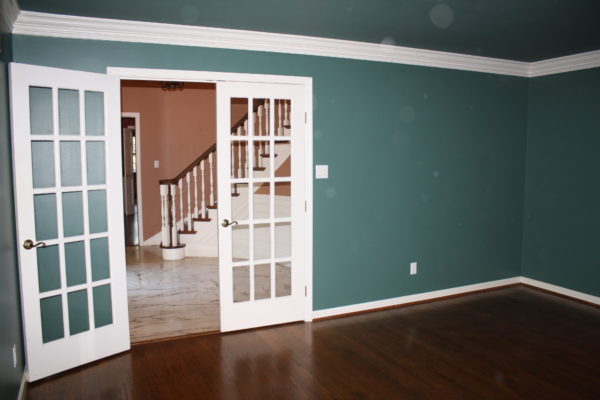
This before shot towards the foyer shows the old french doors that I removed to make the dining room feel more inviting as guests entered our house. The doors seemed to say “keep out” to me and my dining room is one of the main spaces I want my guests to feel welcome and at home.
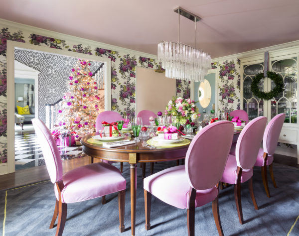
And as I said before, this room was super dark but not only because of the paint. There is only one window in this room, on the front of the house, but I had a solution for more natural light. See that dark corner below?
Well, it now is the home of a fabulous upholstered door with an oval window that allows natural light to flood in from the kitchen and the sunroom on the back of the house. Interestingly, when I opened up the wall to add the door, there was a header there already, indicating that there had been a door here previously and someone decided to close it up. 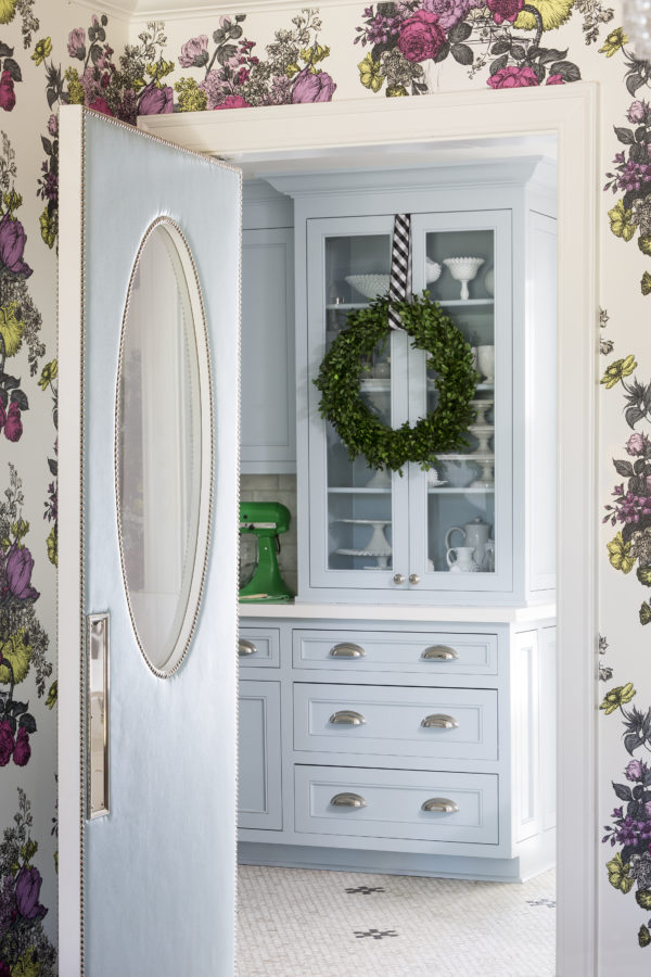
Isn’t that pale blue upholstered door with polished nickel nails super chic? And here are a few more lovely views of this space from other angles…
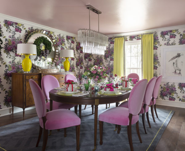
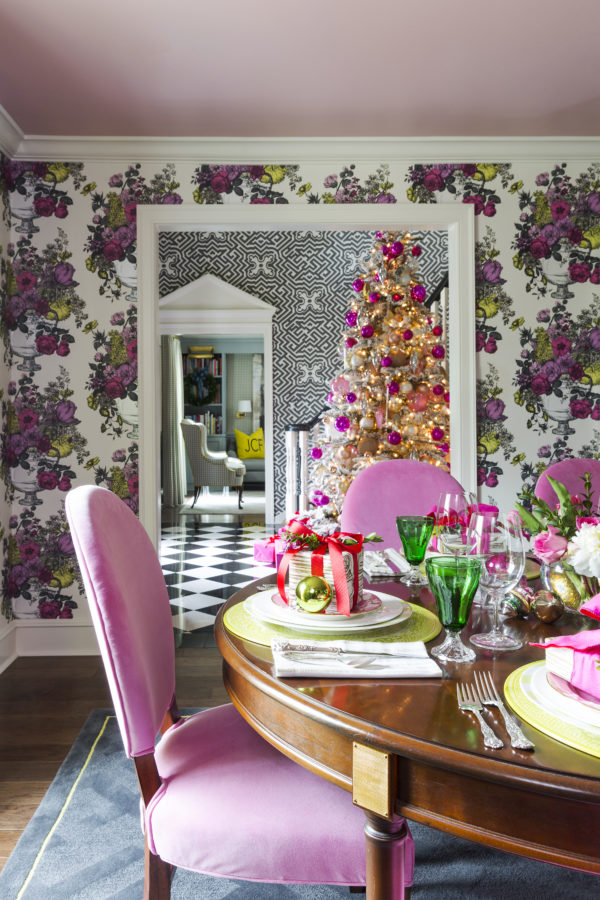
For me, no detail is too small when setting the perfect tablescape, or when it comes to designing a home for you and your family! And I feel the same way about designing the perfect home full of gorgeous design and lots of love for my own family.
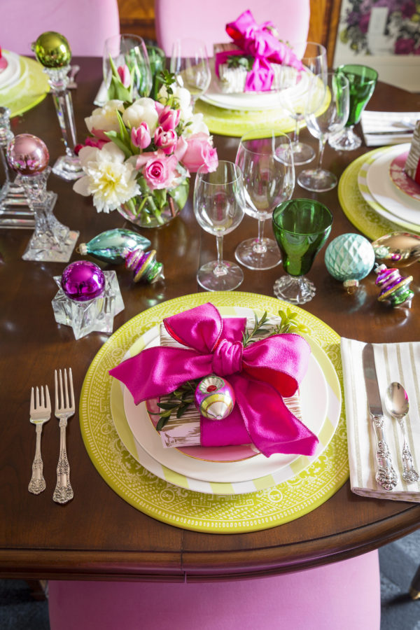
And I try equally hard when entertaining guests.
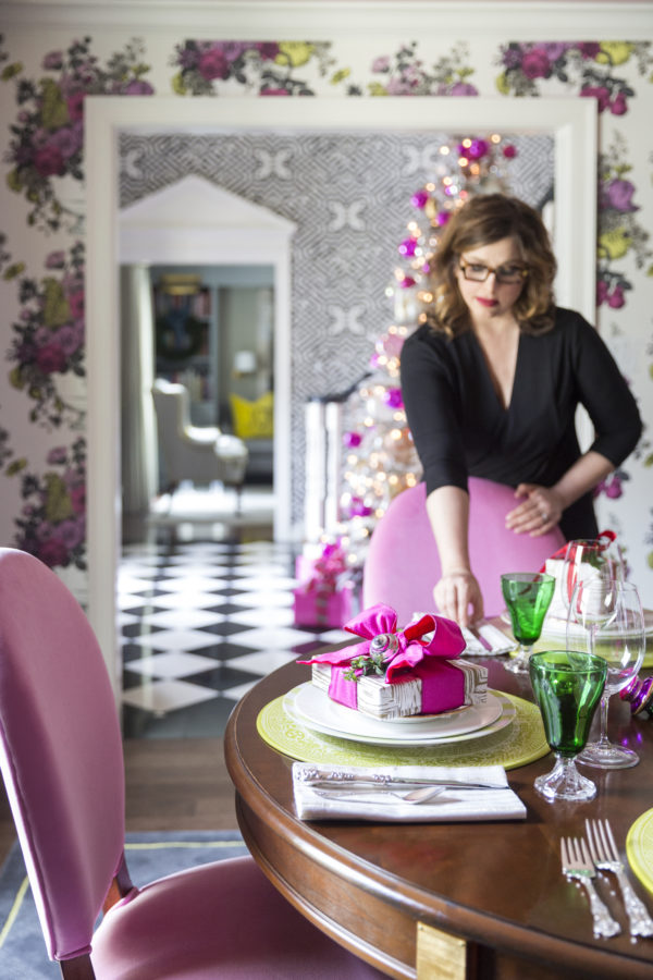
So I hope you love this decor and entertaining inspiration. I’m off to get my tables ready for my Christmas guests. But stay tuned for the next blog post in my Before & After series coming soon.


