It’s here! It’s finally here! I’m so excited to finally share my newly renovated home with all of you and it’s all dressed up in it’s holiday best.

That’s right, my home is featured in the holiday issue of Traditional Home that is hitting news stands today and I can’t contain my excitement! I’m so thankful that all of you have followed me on this journey through the many re-designs, construction, installation and now I get to show you all of the beautiful photographs.
We have so much to talk about: the color story, how I’ve adjusted the layouts, the plumbing, tile, flooring, furniture and every little detail. All of that will be coming in future blog posts. But for today, let’s just revel for a bit (shall we) in the color and the pattern and the excitement of the big reveal.
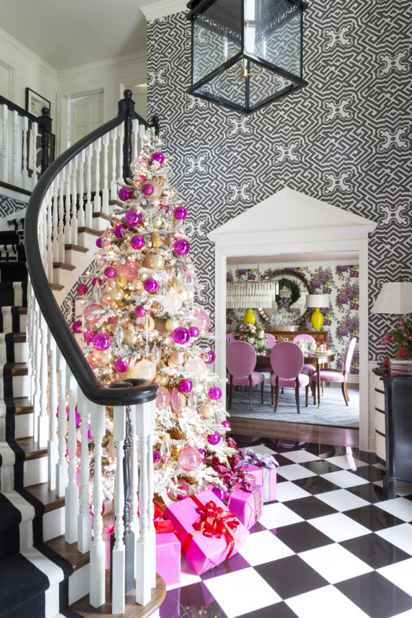
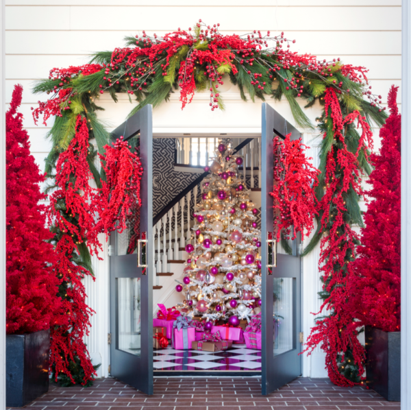
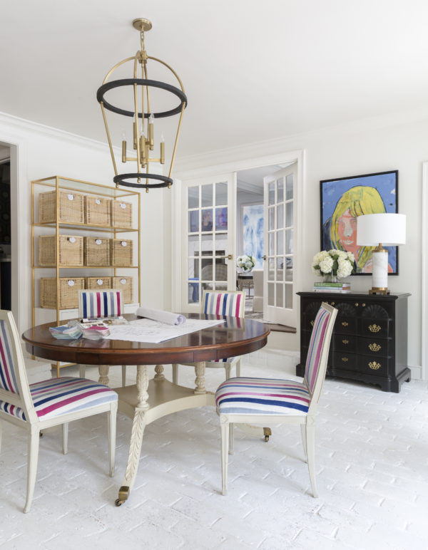
I’m obsessed with my fabulous entry with classic black-and-white checkerboard floors, large scaled Cole & Son wallpaper, and one of my Tobi Fairley for New River Artisans stair runners! My Rothesay lanterns hangs down to light the way into the Dining Room, and the pink and gold Christmas tree sets the tone for all the delicious pink velvet on my freshly recovered dining chairs.
One detail that I don’t want you to miss that made a huge difference in the entry are those pediments I added over the doorways. Architectural detailing does so much for the character of this entry way. I’ll show you what I mean in a future before and after post, you’ll be amazed at the difference.
But just for a minute lets go back and linger on that tree…

Okay, now for the dining room…
I know what you’re thinking, “Pink! How on earth did you get your husband to agree to an all pink and floral Dining Room?!” But to be honest, as long as there is good food on the table and comfy chairs, he doesn’t care what color the walls are, or the ceiling for that matter! And he even admits the pink is really growing on him.
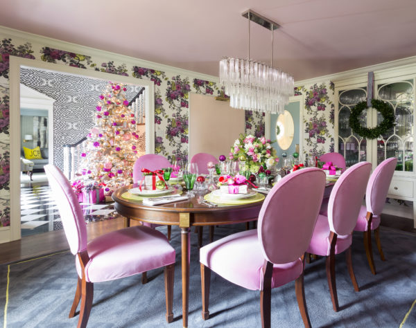
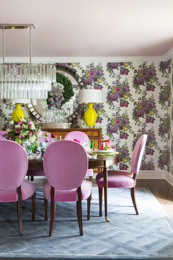
And have you seen the stunning pink and chartreuse Clarke & Clarke floral wallpaper wrapping this room, topped with a light pink ceiling courtesy of C2 Paints.
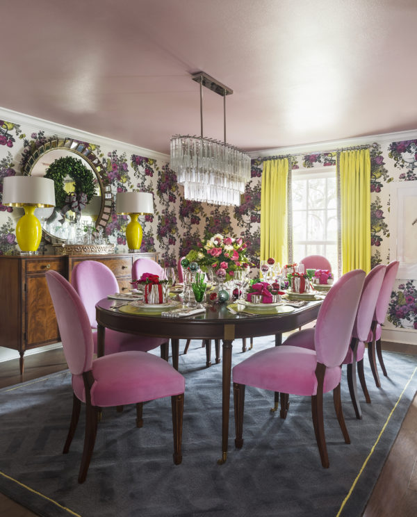
My inspiration for this room started with the gorgeous pair of yellow Jan Showers lamps and evolved from there. There is so much to love in this room if you are a color-lover like me. I can’t decide which detail is my favorite but the pink and yellow color palette is definitely one of the freshest I’ve used. 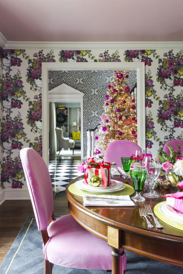
The Dining Room isn’t the only space with a pop of chartreuse. Can you catch a glimpse of my study that’s across the entryway in the background? Let’s take a closer look.
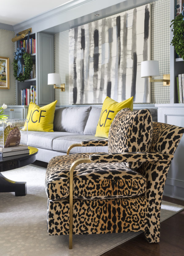
I couldn’t bear not to include my Elle chair from CR Laine in my home. It’s named for my daughter and in this luxe leopard print, it feels iconic. And it’s only part of the fabulous pattern mixing in this space. Throw in that graphic original painting by Jane Booth and this room has a lot of wow!
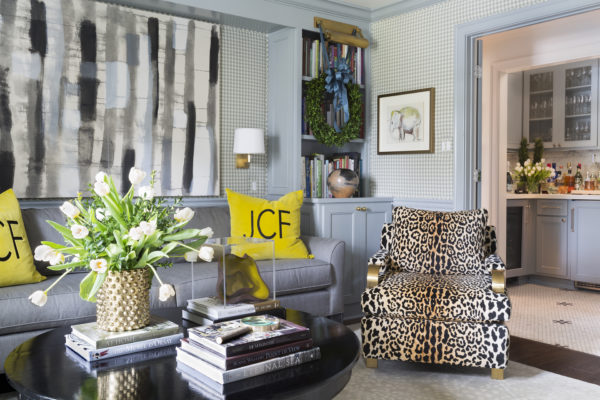
Bookshelves line the walls in the study painted in a moody blue-grey and were added to house my collection of design and architecture books. The walls upholstered in a Clarke & Clarke check, with matching drapery and wing chairs create comfort and charm in this space.
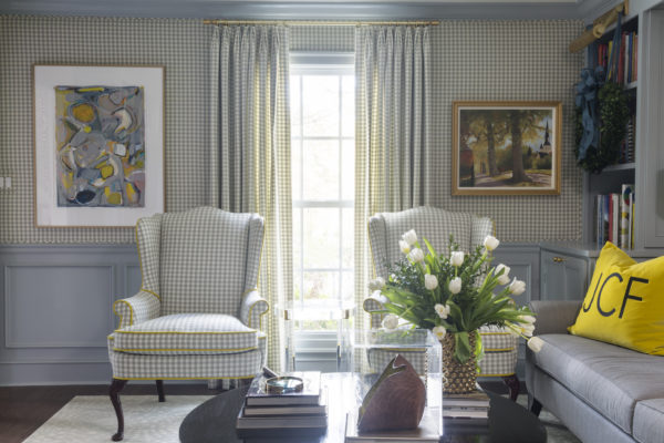
Accents of chartreuse show up in the contrast welt of the wing chairs, my collection of original art (the piece on the left a Christmas present from my amazing hubby!), and on the monogrammed sofa pillows. This study is the favorite room in the house of many of our guests. I think that’s because its quaint and warm. My husband loves to hang out and watch the big game in here, but that may be because it’s just a few steps from the Wet Bar (wink)!
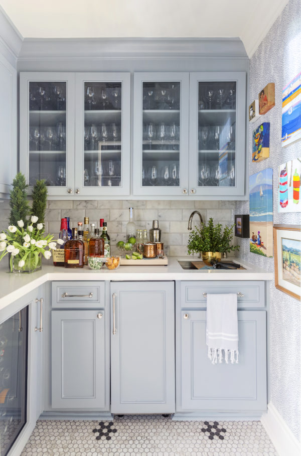
Yes, step right out of the study, and into the Wet Bar for cocktail hour! The same grey-blue covers these cabinets with a beautiful F. Schumacher wallpaper and beveled marble subway tile backsplash. And I love my “mini art” collection (all tiny in size) that I have collected all over the country from Hawaii to Napa Valley to Memphis and locally from Little Rock artists too.
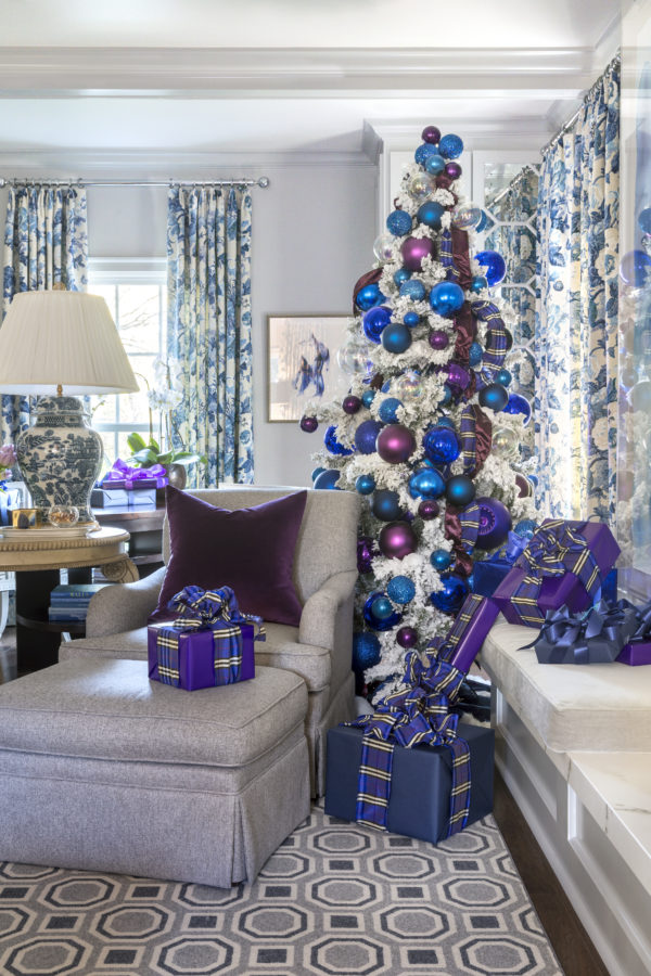
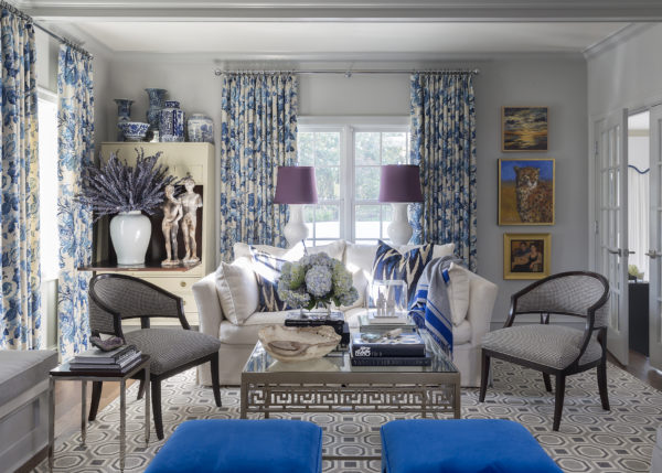
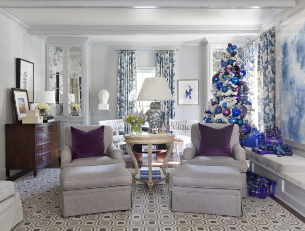
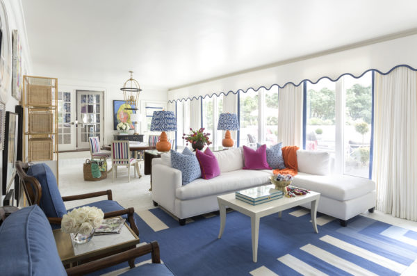
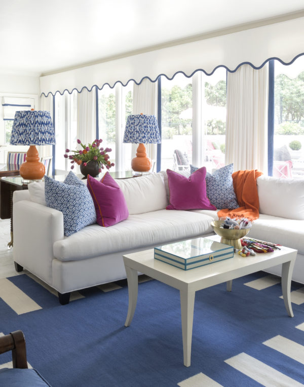
Just a few steps away, my living room may start with a soft grey color palette, but I quickly turned up the volume with accents of bright cobalt, wild leopard print, and deep plum accents for an inviting place to entertain family and friends during the holidays.
If you’ve been following my journey through my New House Diaries blog posts, then you know that my living room is very long, so I created multiple seating areas throughout – all with a line of sight to the TV per my husband’s request! 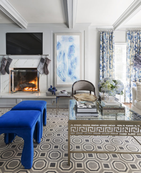
This room, once covered in 1970’s dark paneling, feels SO good with natural light coming from 3 sides. And I am crazy about how the fireplace and hearth turned out. Covered in Dekton solid surface material, and then with a bit of a throw back to the 60’s and 70’s origin of this room I added gray velvet seat cushions on the long hearth for function. I think they give a nod to the “conversation pit” trend from around the time this home was built.
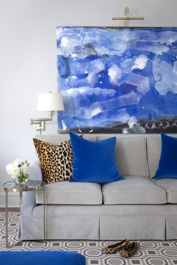
Another stunning piece by Kansas City artist Jane Booth makes this room come alive with cobalt over yet another seating area. We can seat over 20 people in this room for holidays and entertaining. And in the photo below you see how this long room covers so many functions with a desk tucked in the back where many mean games of family scrabble have already taken place.
From the cool grays with that punchy cobalt in the living room, we transition back to softer shades in the kitchen. Situated right in the middle of my house and the hub of all the activity, everything takes a calmer turn with the Kitchen color palette. The cabinets turned out just a I envisioned in a lovely shade of blue from C2 paint. I can honestly say the kitchen is my favorite room in the house!
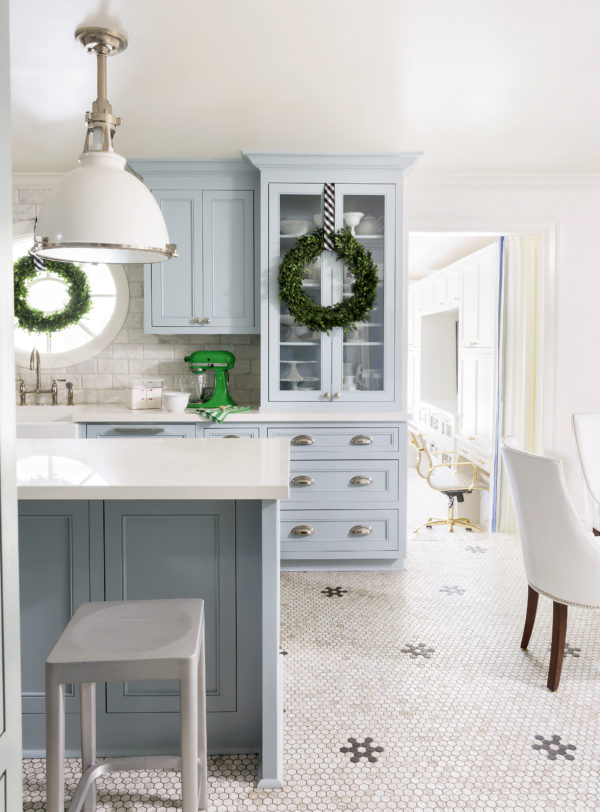
The vintage-style bistro flooring is definitely a highlight of this room. It’s actually a glass tile from Daltile with the look of marble. I am so happy with the look and function of this flooring, especially because it fits the age and architectural style of my home so well. But what I upgraded from the “Brady-bunch” era of this home is that stunning oval window over the sink. Remember when that was a giant pass-through that looked dated and drab? Now that area is anything but!
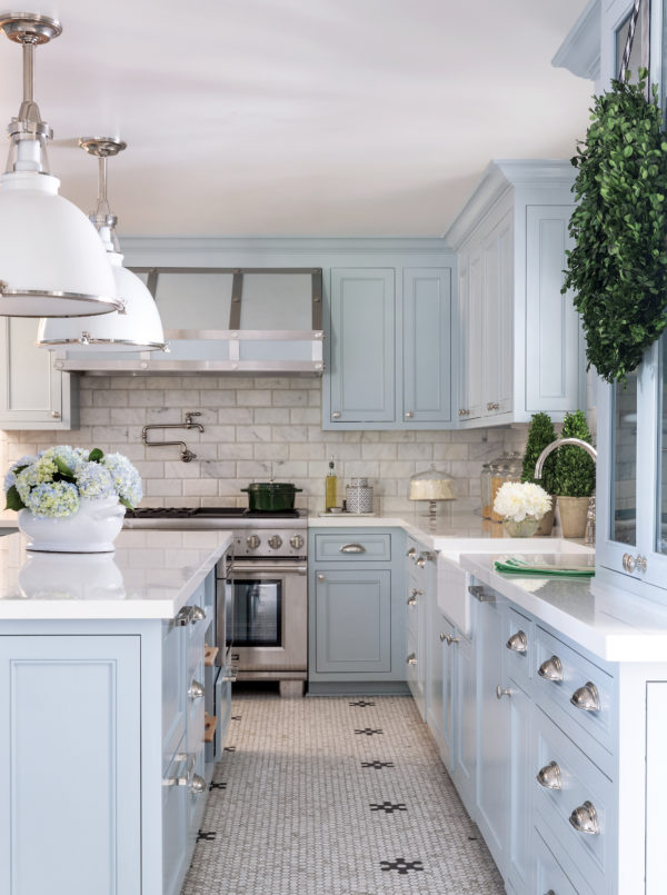
As you will see when I remind you of the floorplan changes I made, the extra 3 feet of length I added to the kitchen made the space extremely functional and allowed for the great new island.
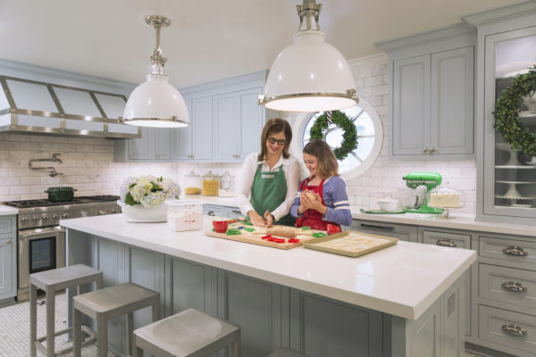
Lots of baking, food prep and serving happens on the island and it’s all illuminated by those handsome, oversized pendants by Hudson Valley Lighting.
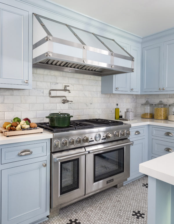
My luxurious Thermador appliances are certainly the focal point of my new kitchen. And finding the perfect range hood for my pale blue cabinetry was hard, so I had one custom made and painted to match. I love how the powdery paint color and the stainless steel banding look together.
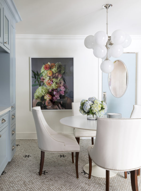
The breakfast room is crisp, white and simple, and looks gorgeous as an extension of the kitchen. And you may recognize the photograph by Kristen Hatgi that I used in the Hampton’s Designer Showhouse in 2014. I loved that piece so much I couldn’t let it go, so I designed my breakfast room around it. The photograph hangs in the high traffic area from my bedroom to the kitchen, and is the first thing I see when coming in from the garage, so I enjoy looking at it many times everyday.
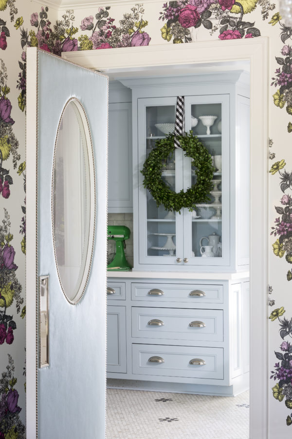
You may have seen a glimpse of the finished upholstered door between the dining and breakfast rooms in the previous pictures. And you may remember the “in progress” photos of it from my Instagram feed when I was deciding on the perfect color for it.
I settled on a pale blue vinyl that perfectly matches my kitchen cabinetry, with polished nickel nailheads and pushplates. I would say this door is the item that gets the most attention from our guests. It really is charming. I mean who wouldn’t love an upholstered swinging door with an oval window in their home?
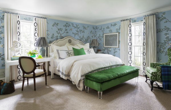
Next door in my Master suite, light blue, Kelly green, and timeless black-and-white create this serene retreat for my husband and me. After a long day, my bedroom has always been my location of choice to unwind. And now that I work from home, this is where I find myself most often during the day, working at my bedside desk with a lovely view out the window and down our pretty street.
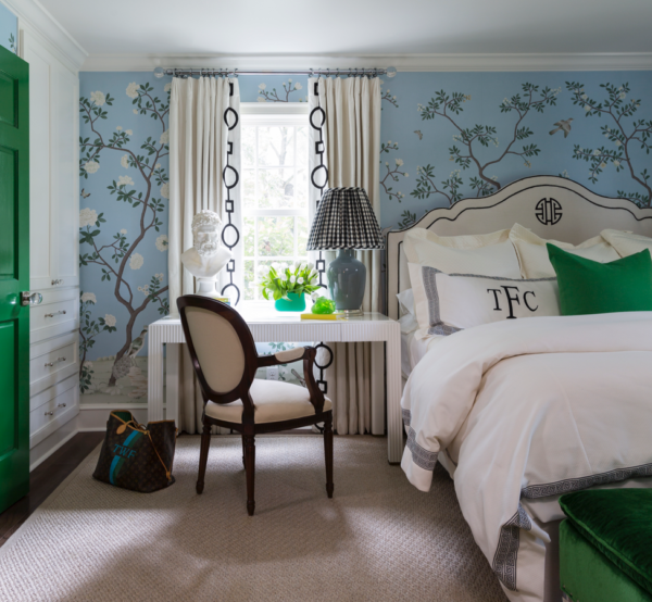
The digitally-printed Chinoiserie wallpaper from Fromental, the black-and-white Lucy bed from my collection for CR Laine, and green Barclay Butera wing chairs (do you remember these from my previous home?) cover this space in blissful colors and interesting textures to ease my mind.
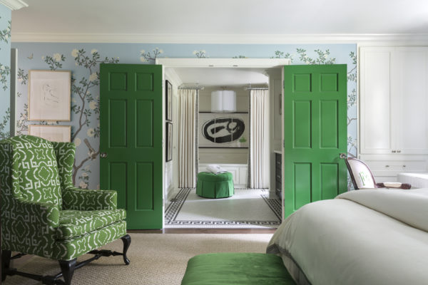
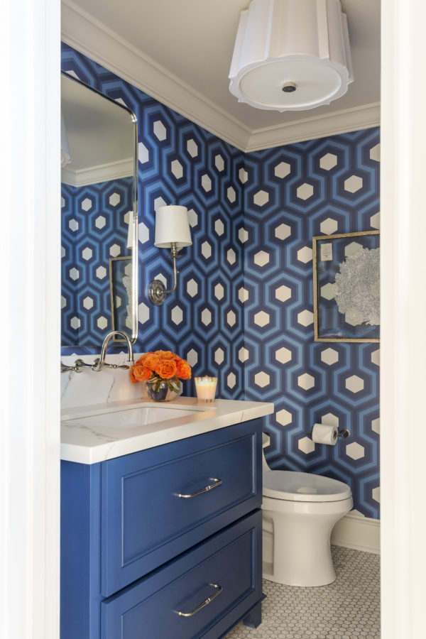
And just through those Kelly green double doors lies the most relaxing Master Bathroom.
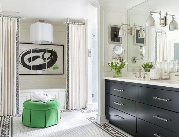
With black and white and pops of green, this stunning bathroom is all mine! A chic Greek Key border–thanks to daltile–lines the room and highlights my ultra-relaxing new Kohler VibrAcoustic tub (seriously…it plays spa music y’all!) and the high-performing white beveled subway tiled shower!
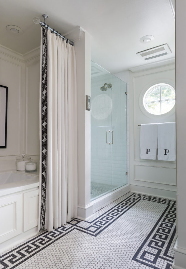
I’m thrilled to begin and end my days here! That pretty little round window we installed adds gorgeous natural light to this previously dark space. And thankfully, the shower is almost double its original size. This black-and-white color scheme is such a classic, I don’t think I’ll ever tire of it and it certainly won’t go out of style.
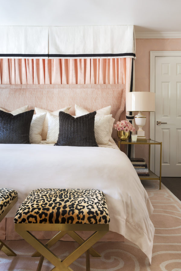
And speaking of relaxing, my guest room definitely fits that description too. It’s black and white and pink all over! Well, blush to be exact, but you get the idea. Yes my guest bedroom took a seriously chic and feminine spin with blush upholstered walls, headboard, rug, and bedding.
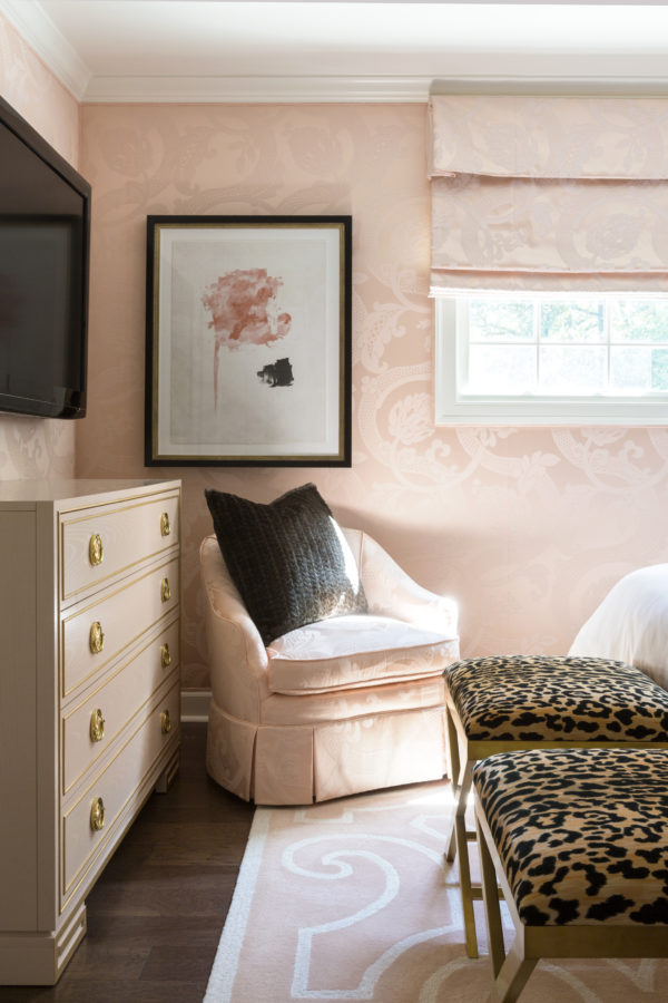
I wanted my guests to feel like they were staying in a glamorous five-star hotel, so I indulged in upholstering the walls in my Tobi Fairley for Duralee collection Isabella Damask and covered the headboard in my velvet Faux Bois. I think the faux fur pillows and leopard print x-benches help bring the luxe to this relaxing space!
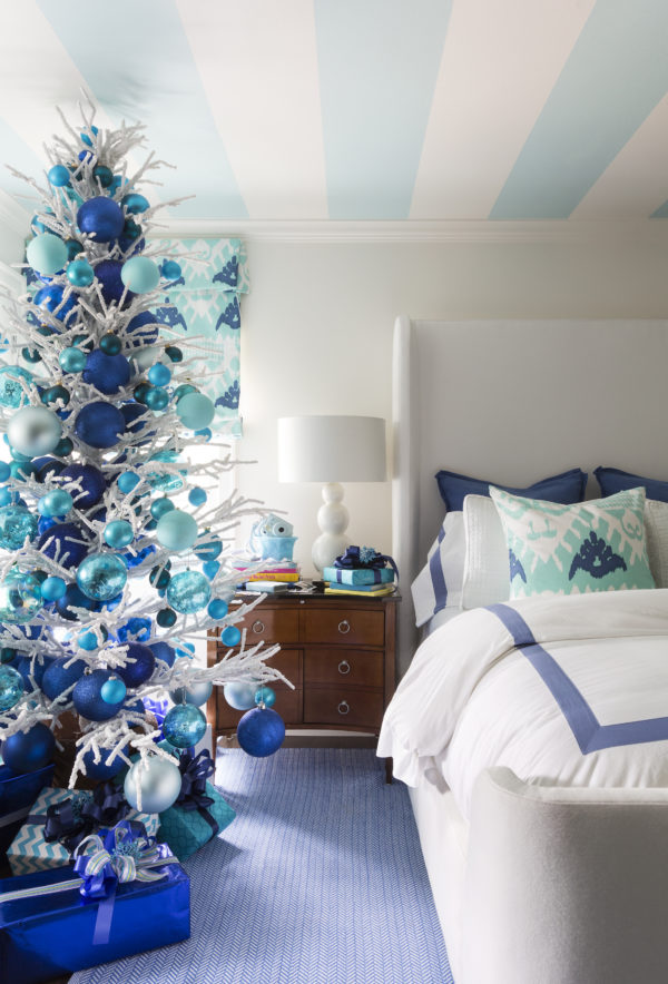
Just down the hall from the guest retreat, the design is decidedly not pink. Turquoise, white, and cobalt blue are the colors my pre-teen wanted, and that’s what she got!
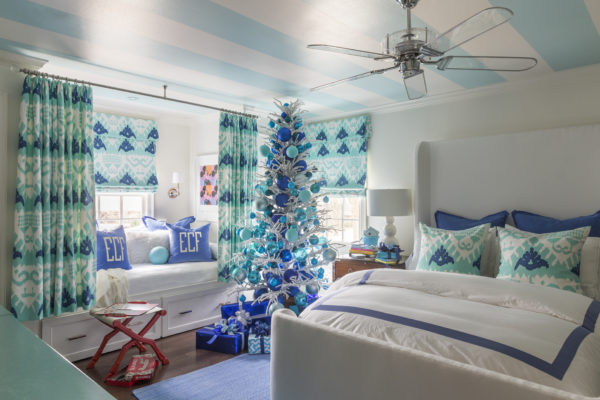
The striped ceiling (her idea) and ikat draperies are perfect as she grows from a pre-teen to a teen. She and her friends have plenty of room to spread out from her queen bed to her built-in daybed with a hidden trundle. This room seems to constantly house teenage girls for all of their slumber parties and I couldn’t be happier about it!
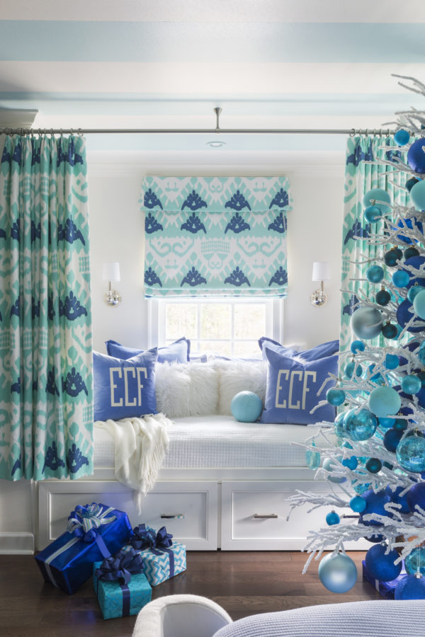
And when my house gets overly quiet, I can bet that my preteen is tucked away in her daybed with curtains drawn, headphones in and her favorite episode on youtube or Netflix playing on her ipad.
And here’s one last space that you haven’t seen.
My sunroom (off the kitchen) was originally planned to be another living space and it certainly does double duty as that thanks to my comfy Taylor sectional from CR Laine.
And it’s the way to this cute powder room which works perfectly for my design team and clients by day and also for our family and friends on nights and weekends.
But now that I moved my design studio into my home, the sunroom’s main job is playing office for my team and me.
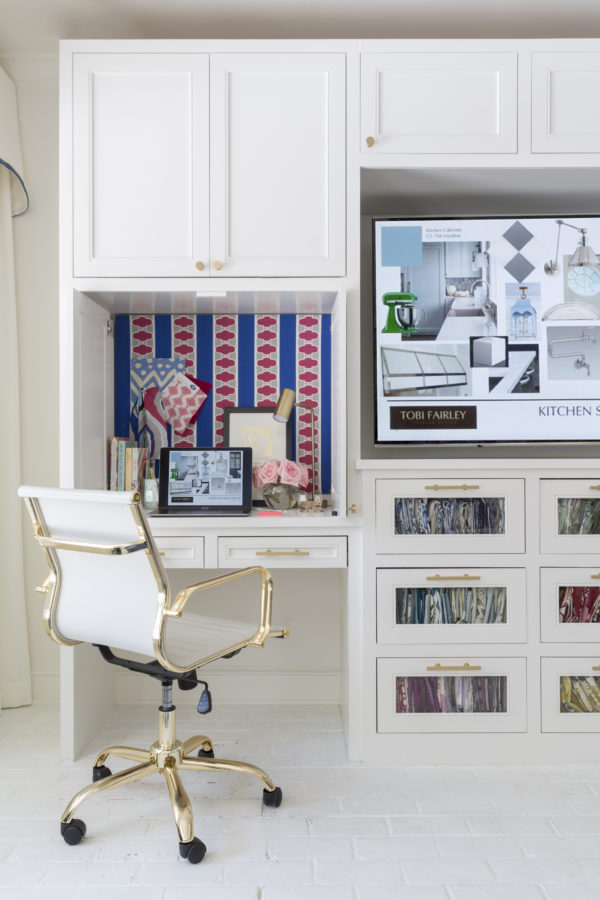
How great it is to work from home in this sunny space with all the windows that look out onto our pool and the golf course beyond? And what’s even better is that I am home when my family arrives at the end of the day!
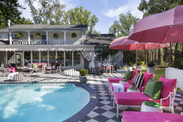
And just for fun, here’s a look back at my pool that lies just beyond the sunroom. No matter if you come in the the front door or the back, the story in my new house is definitely pink!

All of this fabulosity was captured by my photographer extraordinaire, Nancy Nolan. Without Nancy, you would never be able to experience all the nuances and layers of my work in such vivid color and composition! And she even captured our sweet baby Beckett who was a tiny pup last year when we photographed the house.
So what do you think? Was it worth the wait? The good news is I have barely scratched the surface of telling you about all the choices I made throughout the renovation!
So for more, be sure and check out the latest issue of Traditional Home for the full spread, and the fun article on my family and our favorite holiday traditions. And for a refresher on the before and during of this process, revisit my Transformations section of the Traditional Home website for all the articles and photos. Then stay tuned for more details from me coming right here on the blog. And I will finally release all the videos of the process soon too. Trust me, there isn’t a detail that we won’t discuss.
xo,